When a UK-based HR company reached out to Unravel to create a design system, the goal was to knit together a consistent look and feel for several software products. The company’s product portfolio includes intelligent HR, payroll, LMS, and recruitment software that help HR teams work seamlessly while providing precious human insight to inform people strategy.
Since these products are used by other companies and customized to match their branding, the design system needs to support white labeling in an easy way.
Read on to find out how we did this.
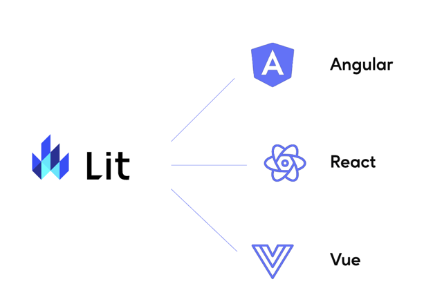
Compatible with all external frameworks
One of our design drivers was to use as few external libraries as possible. Using web components allowed us to create one set of components that works for every project team, no matter what framework they use (Angular, React, Vue etc).
Focused learning is all about interaction and attention. However, from the designer’s perspective it is equally important to unravel user’s approach to the learning process. How and why they behave unexpectedly? Are they following the learning path the way we expect them to? With UI audit we had to dentify interruptions and distractions that might ruin the learning experience and result in resistance to the training.
Easily customizable for additional brand
White labeling in the context of design systems refers to the ability to customize and brand a design system to match the visual identity of a particular product, service or company. In other words, it allows you to apply your own branding, colors, logos, and other visual elements to a design system, so that it seamlessly integrates with the overall look and feel of your brand.

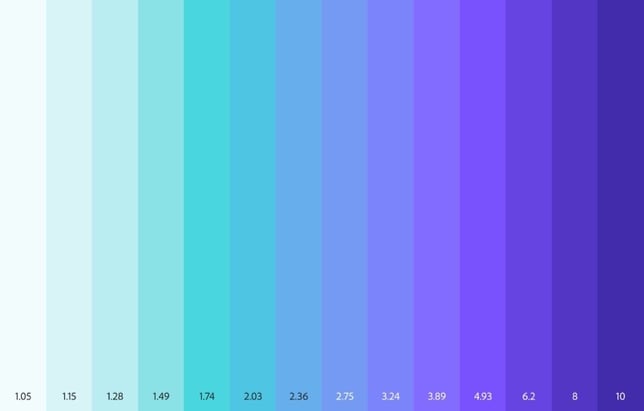
White labelling meets accessibility
Leonardo is Adobe’s tool for creating, managing, and sharing accessible color systems for user interface design and data visualization.
This allows for super easy white labeling, where the end-customer only needs to supply one main brand color and the tool generates a fully accessible palette from there.
Automating design changes with development
 1. Change in Figma
E.g. one of the components receives an update from a designer.
 2. Library update
Once the update is ready, it is then synced with the componentslibrary.
 3. Code update via API
Since Figma allows for the libraries to ve accessed through API, one call from a developer maked the code up-todate with the design.
The journey of a component
 1. Research
Evaluating what properties a given component needs.
 2. Discovery
Design team meets developers and QAs. +  Accessibility check.
3. Design
Designing the actual component in Figma.
 4. Develop
Design elements are coded into Web Components.
 5. QA
5. QA
Making sure that development meets design. + Accessibility check.
 6. Implementation
Using the components in a real life scenario.
.jpg?width=1612&height=720&name=image%20(26).jpg)
.jpg?width=1612&height=720&name=image%20(23).jpg)
.jpg?width=1612&height=720&name=image%20(27).jpg)