.png)
The idea
The idea for the project was born through the cooperation of Unravel with Tech To The Rescue and the #TechForUkraine initiative. Tech To The Rescue is a foundation that connects non-profit organizations with technology companies to provide them with tech help and maximize their operations. To help in this challenging time, we wanted to use our design and product potential and offer professional assistance to organizations that support those in need. Through this program, we learned about the needs of the Strefa WolnoSłowa Foundation to redesign the website of one of their projects - Migrart. It is a platform where migrants and refugees living in Poland can share their work. This initiative seems particularly important now due to the war in Ukraine, which has left many creatives looking for new career prospects and a place to live.
Strefa WolnoSłowa Foundation is an initiative of people working in the field of culture and art to support artists who are excluded or threatened by marginalization. The Foundation organizes artistic, cultural, and educational intercultural and intergenerational dialogue activities. Since 2012 they have carried out initiatives like The City Ghettos of Today, Migrating Theatre, The History Atlas Under Construction, Beyond Theatre, and Migrart. The main goal is to engage refugees and migrants living in Poland and encourage them in creative activities.
Introducing Migrart
Migration processes are steadily increasing. People decide to relocate to another country every day for better life opportunities or looking for new challenges. For artists and creators starting a new life in Poland, Strefa WolnoSłowa Foundation has prepared the Migrart initiative. Currently, when thousands of artists relocated to Poland due to war in Ukraine, this initiative brings crucial help to migrating artists.
The project is the first online platform to present the works of migrant creatives living in Poland. This website aims to connect migrant artists of various backgrounds with their potential clients and employers. It offers a database with contacts and portfolios of artists. It provides regular networking meetings in which they can share stories and experiences.
"The website was created to connect artists with their potential clients. Therefore, we focused on a clear and attractive presentation of artists' work. We wanted to give them a dedicated space to present their skills and portfolio. It’s their place to highlight their best piece of work and personality."
- Michał Ługowski,
Product Designer at Unravel
Website redesign. Where do we start?
At first, we wanted to identify the goals and needs of the initiative. To do that, we prepared a micro-audit and analyzed the current website and user path. We concluded that the platform needs a redesign on a few key levels. The primary necessity of this project was to make the website navigation clearer and more intuitive. Our research was complemented by previous feedback from users, which confirmed our belief that the website needs greater clarity of communication.
The site's most significant issues were usability flows and an unclear and difficult-to-understand intention of the website. Particularly problematic was the onboarding process, which was long and lacked stages. We also saw the need to create user profiles to show not the artists themselves but their work and skills.
The process of analysis and research helped us define the following pain points:
- Lack of information on the home page about what the website is for.
- The main page focused only on showing numerous photos of artists added recently.
- The search engine, in the form of a category listing, was hidden behind an extra click.
- Additionally, whenever a user entered or returned to the homepage, an annoying pop-up appeared inviting them to fill in an application form.
- Long and complicated application form.
- Several steps in the application form.
- Complex instructions to add portfolio.
- The form allowed users to type in any creative areas from which search tags were created, which complicated the overall search.
- Hard to read artist profile with linearly arranged bio, creative areas, and links to works.
Solution proposal and kick off the design part.
Knowing the goal of the project and understanding the pain points (above) on a currently existing website, we prepared a proposal of a few potential solutions. Our goal was to connect our design experience with the Foundation vision and the long-term purpose of the website. Once we had all the necessary information, we began redesigning the site.
Content presentation and information architecture
Website visitors are looking for new talents. Therefore, we had to redesign how information was presented to simplify the user search path. We focused on information architecture and interesting content presentation.
- We have added a descriptive Hero section to tackle the lack of information about the initiative on the homepage. This allowed us to efficiently present what the Migrart project is and what its goals are.
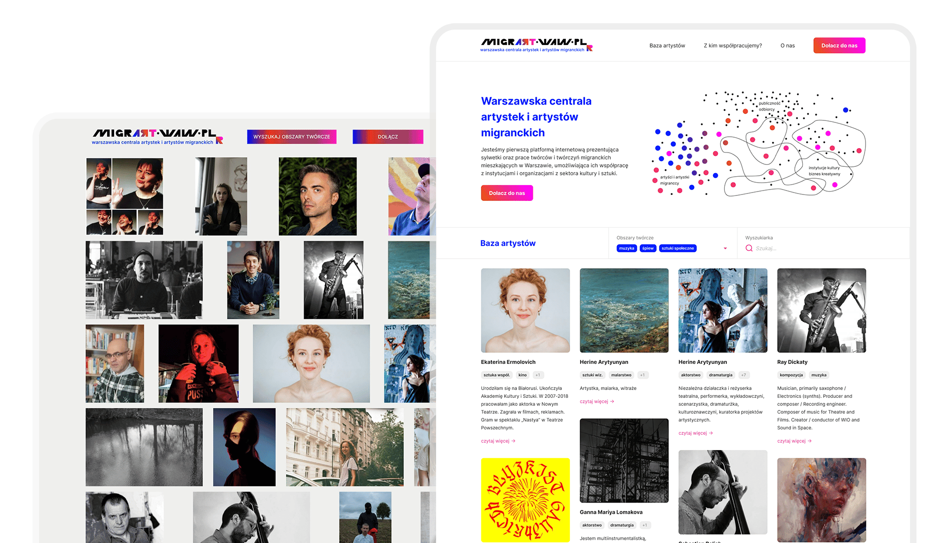
- The new version of the main page still shows the recently added artist. But, in addition to the cover photo, it describes the author's activities and works.
- Another thing we have incorporated into the homepage was the search engine. As before, you can sort by creative field, but now there is also the possibility to filter artists by their name. All that has made the site's primary functionality immediately visible and more intuitive.
- Another problem we wanted to solve was a pop-up on the main page. We have decided to abandon it altogether. Instead, we used a CTA button on the navigation bar to encourage people to participate. This solution does not overshadow the view of the page and still redirects to the form.
Before – After
Designing the application form – best practices
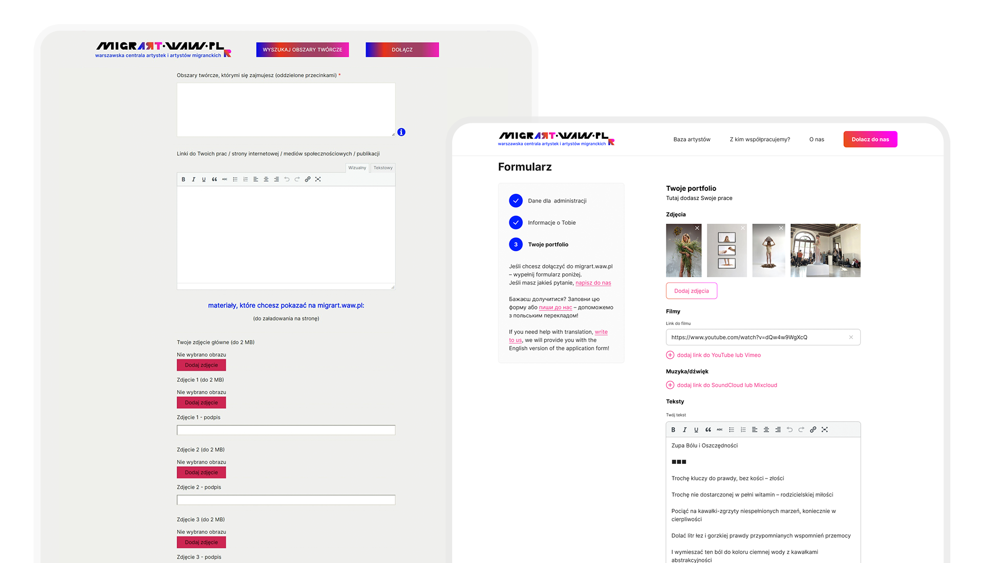
The crucial thing to simplify was the application form itself. The previous version was extended, unsegmented, and challenging to follow.
- Unnecessary and confusing steps were removed to shorten the application form.
- To make the form more transparent, it was divided into three main stages and added a bar on the left side indicating which step is currently in progress.
- Uploading the portfolio was simplified.
- We let the artists choose the section that suits them best and that they want to add to their portfolios.
- The section was shorted and designed to encourage artists to add cover photos of their work and their profiles at the time of registration.
- As a result of alignment and workshop, creative areas were predefined and structured, making it easier for artists and visitors to find what they needed. A tag cloud gave the ability to search and filter them. This approach prevents adding incorrect, misleading, or irrelevant creative areas.
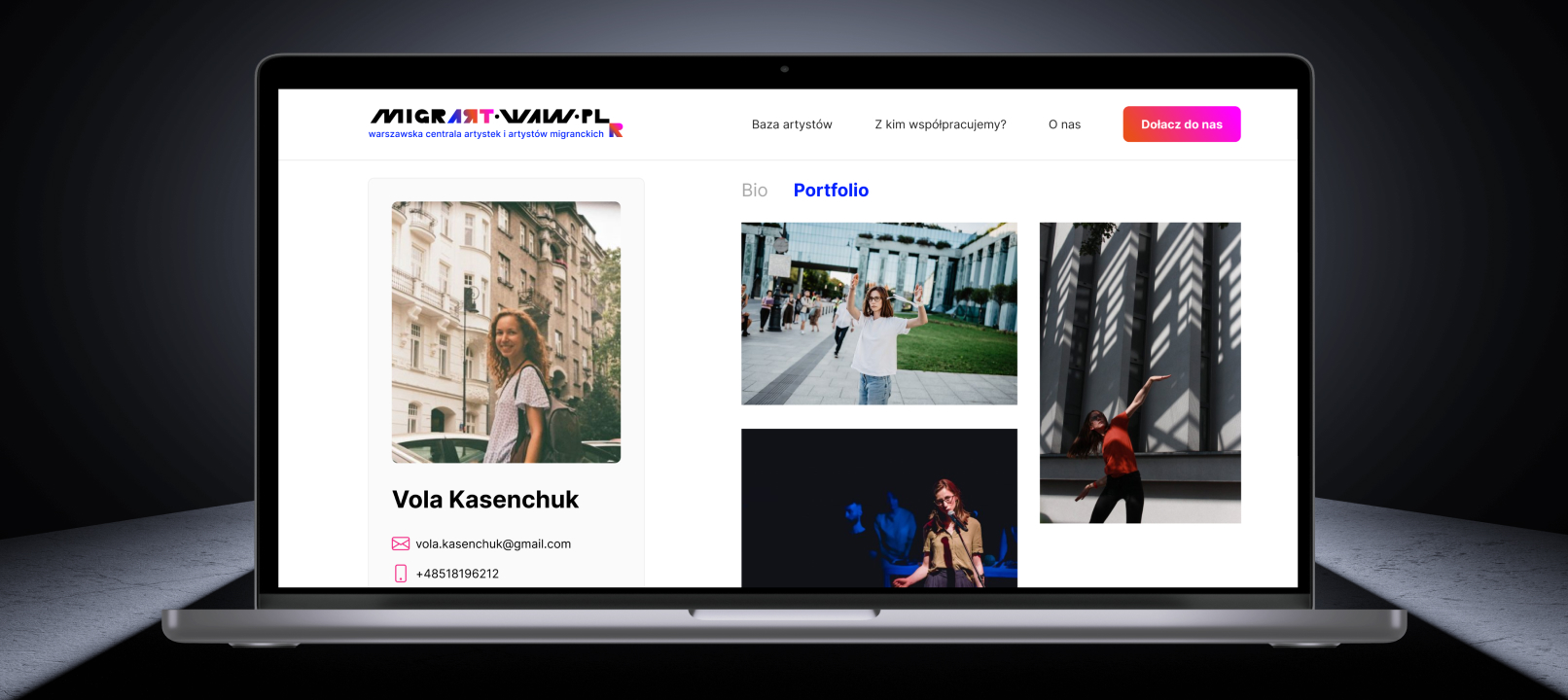
- The artist’s profile has been simplified and organized into two sections: bio and portfolio. There is a contact section on the left side, which is always visible. This section contains basic information about the artist and links to their external pages or other portfolios.
Before – After
Was the Migrart website goal achieved?
As a result, we designed a website that is much easier to use. The main tasks that either visitors or artists perform on the website were simplified thanks to the new information structure. The overall improvement of the website makes it more intuitive and ready to serve its core mission.
Contact our team if you are interested in conducting a similar micro-audit and redesign for your project.


.png?width=516&height=171&name=Picture%20(7).png)